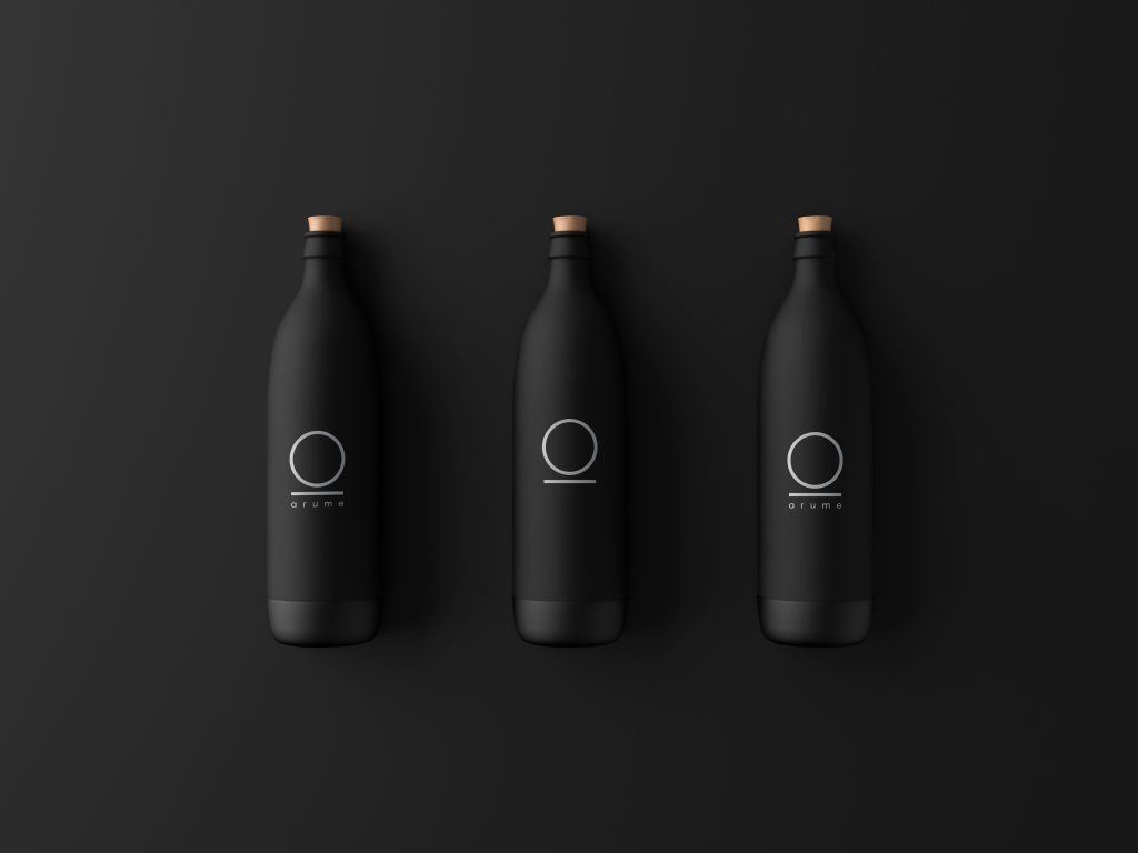
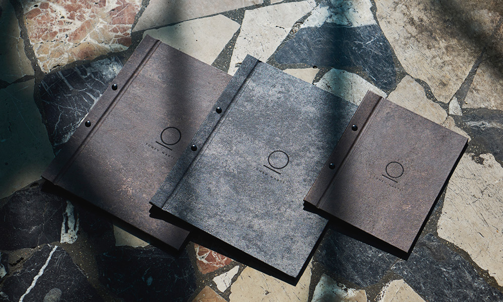
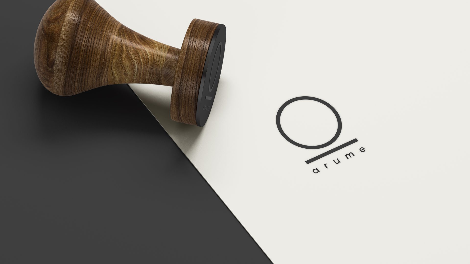
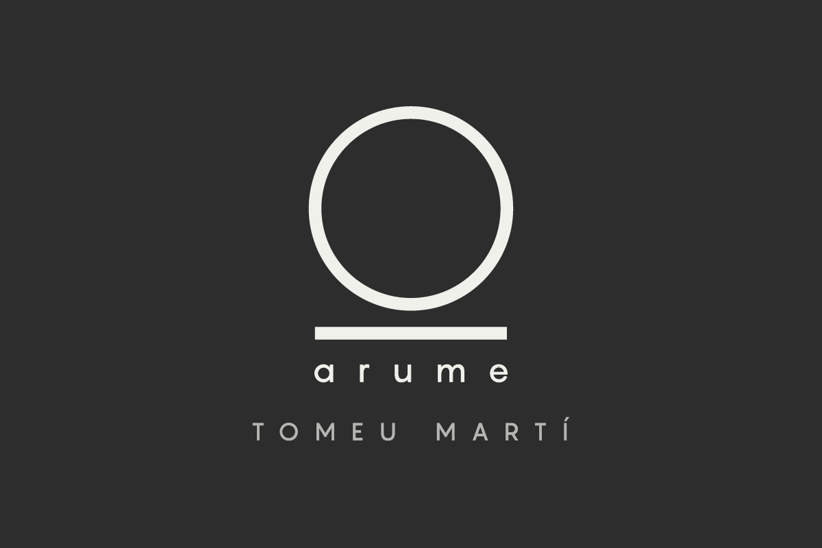
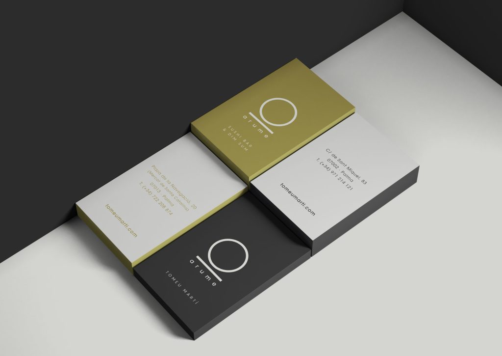
To create the isotype we started from the ‘a’ with which the original brand was identified, rotating and simplifying it, obtaining 2 simple forms but loaded of meaning, the circle, basic form that suggests balance and perfection, and the line, which indicates that we never stray from our path, we always move in a straight line, being essential parts of the Arume proposal.
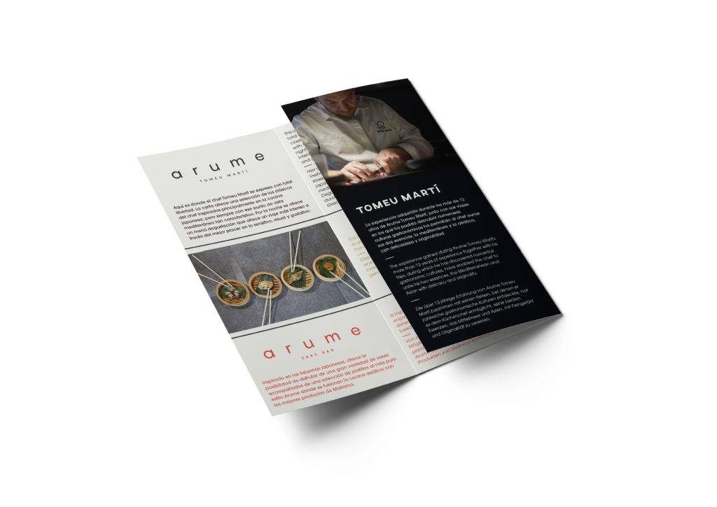
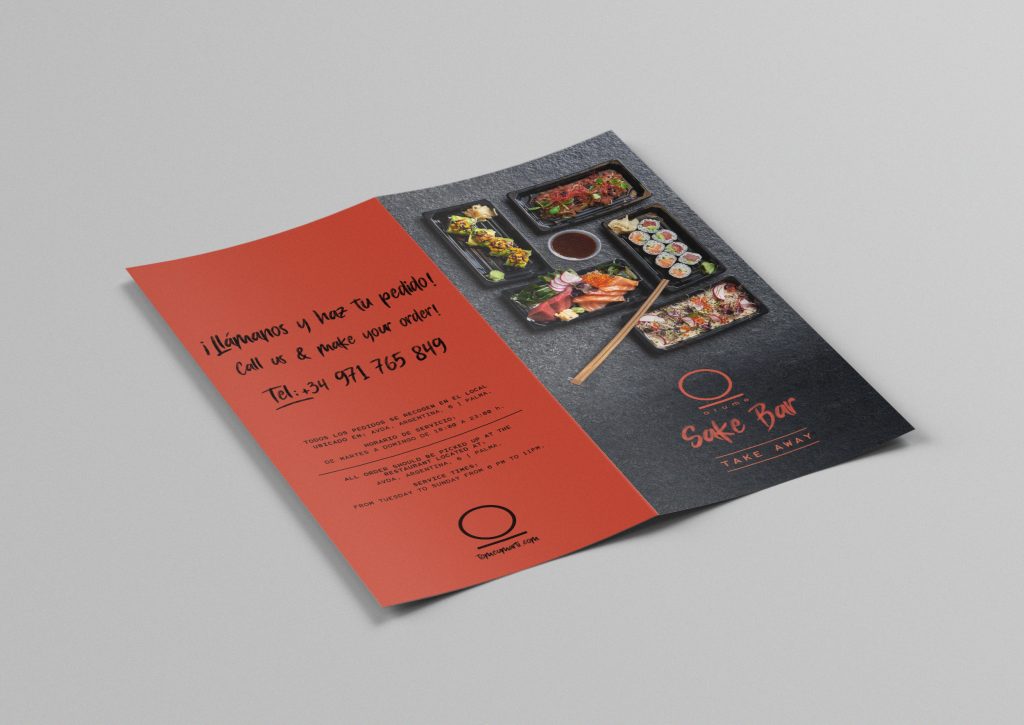
When we had to differentiate the 3 premises of Arume, Tomeu Martí, Sushi Bar & Dim Sum and Sake Bar, we opted for a chromatic range that represented the essence of each of them, from the elegance of Arume Tomeu Martí, through the informal and fun proposal of the sushi bar located in the Santa Catalina market, until its last opening, Arume Sake Bar, a Japanese-inspired tavern.