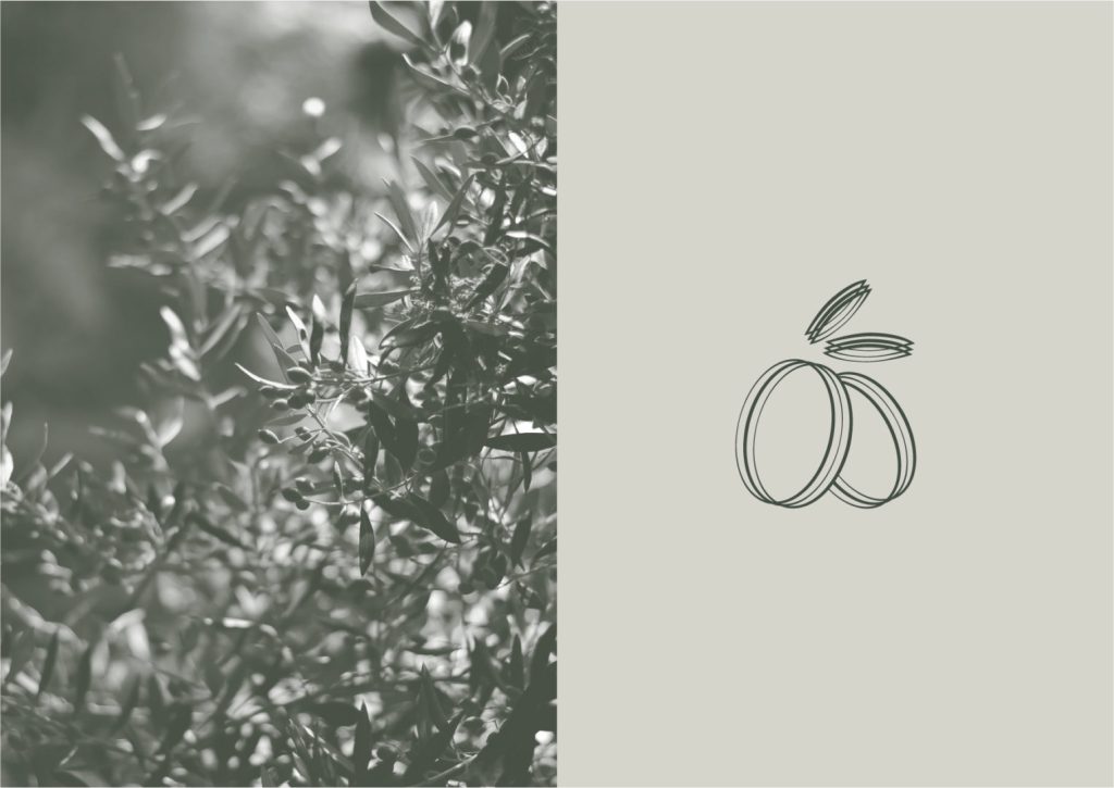
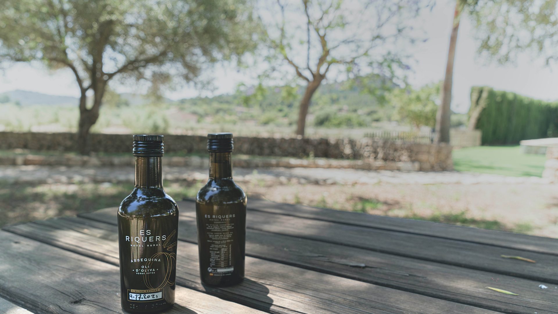
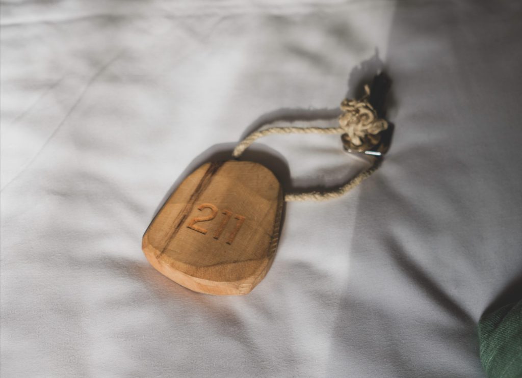
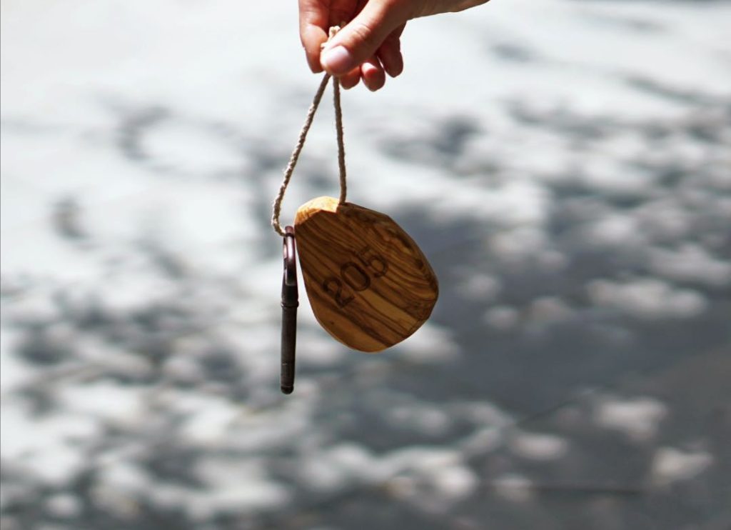
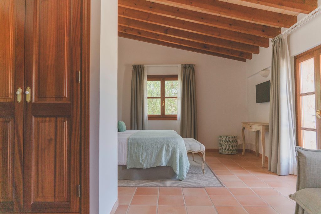
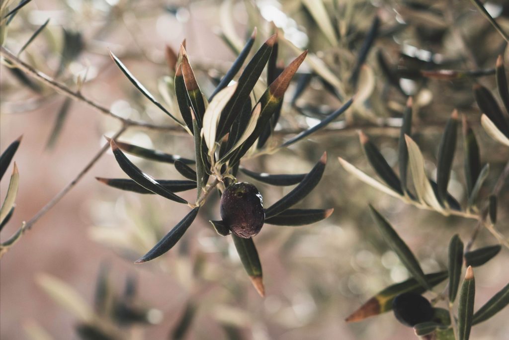
To develop the brand we have been inspired by one of the most outstanding elements in Es Riquers, its olive trees. We wanted to reflect the spirit of the new hotel through a brand that conveys the essence and personality of the new project.
We Believe that the brand should reflect how its marked rustic character is combined with a simple and elegant interior design as well as modern, highlighting the olives as a representative element of Es Riquers.
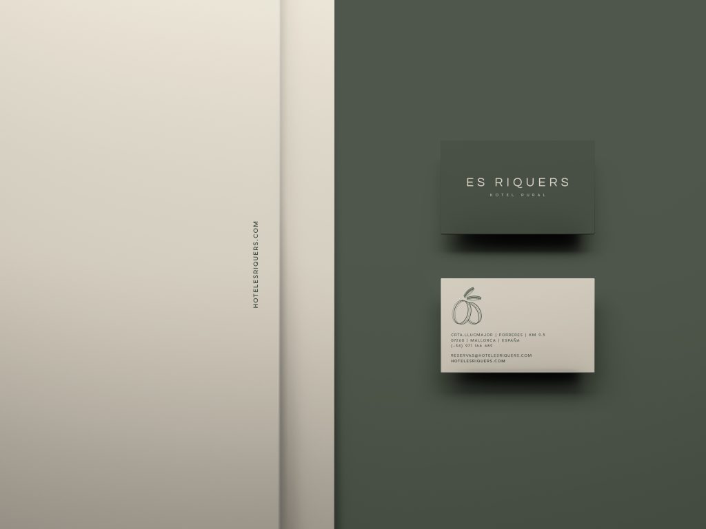
For the design of its new corporate identity we have chosen a font that has a modern style, but in turn recalls the past characteristics of great typefaces. Its full circle curves give the logo the uniqueness that we believe must convey this brand.
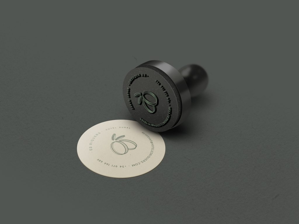
The visual identity evokes that simplicity, which combined with the so characteristic green of the olives, creates an elegant and warm set, perfectly representing the essence of Es Riquers.