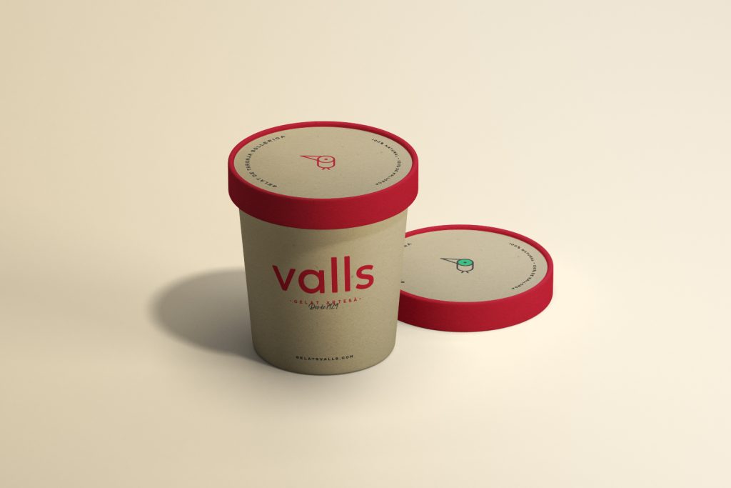
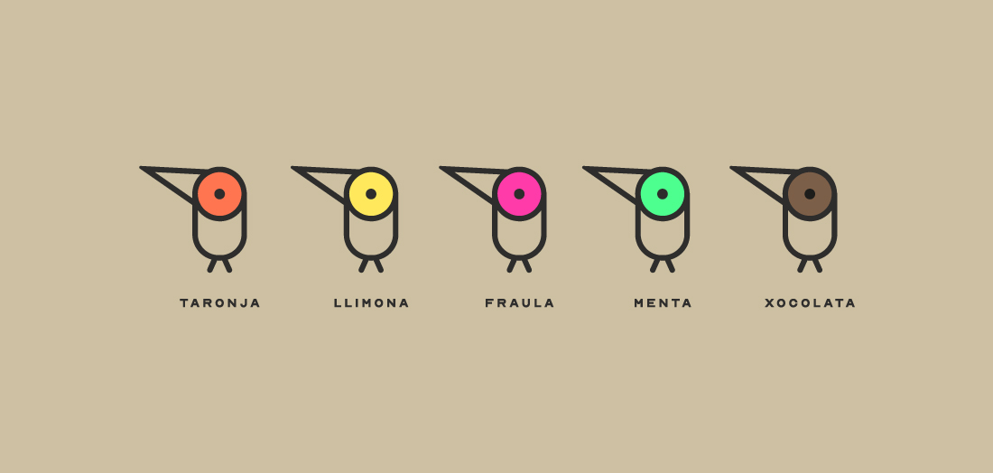
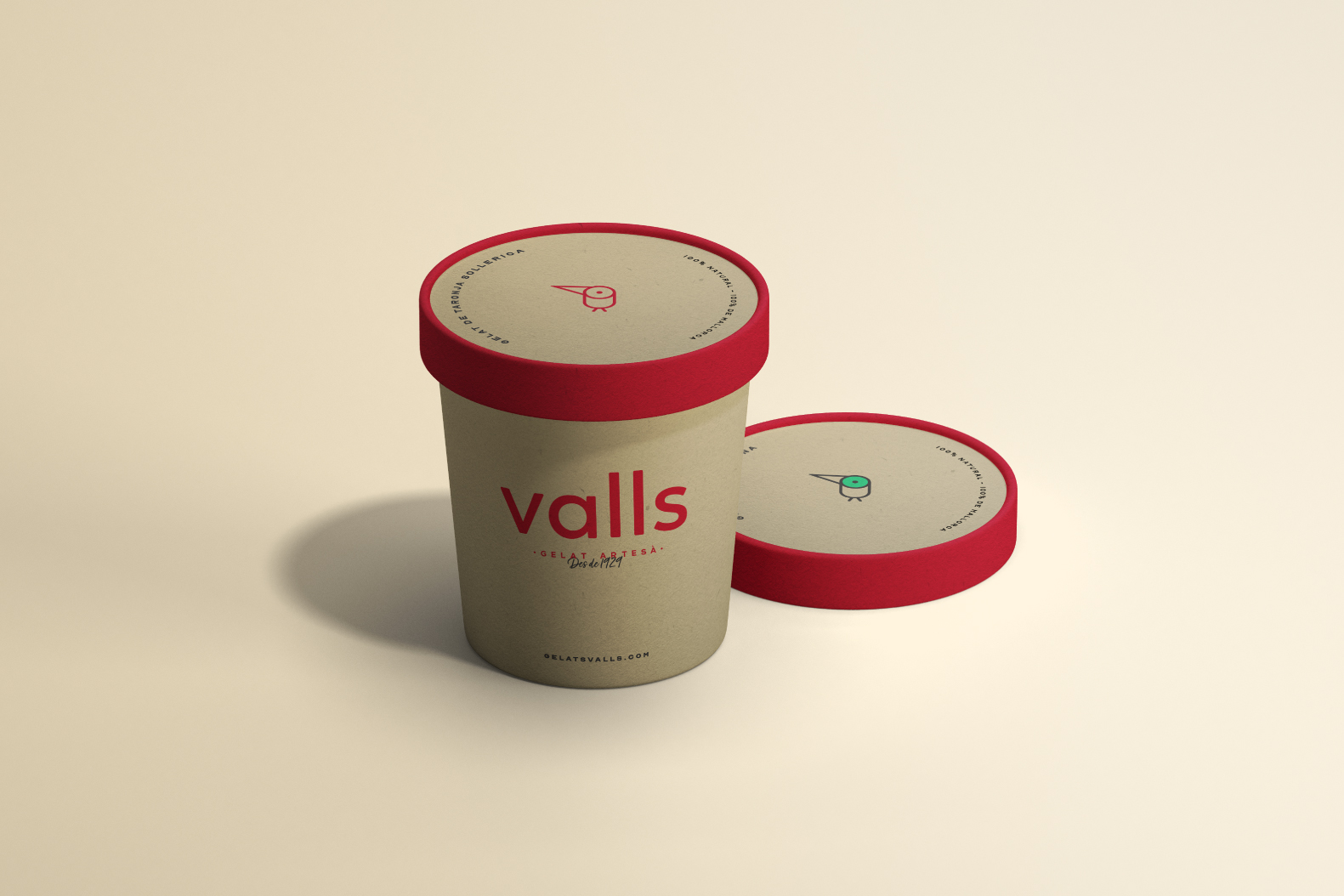
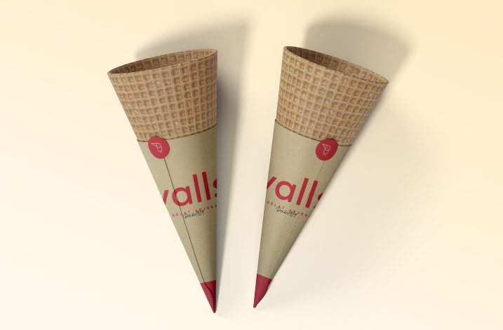
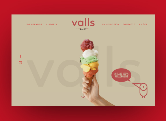
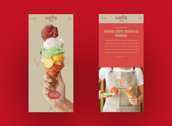
On the other hand, the imagotype and the color palette have been decisive in this project since the red color and the penguin of the original logo have always been the elements for which the brand has been identified for generations, so it was essential to maintain them , but giving a new style and adapting them to current uses.
With this brand design we wanted to reinforce the position of Gelats Valls and turn it into a fresh, Mediterranean, close brand that represents the artisan value of its products.
The project has been listed in The Best Ice Cream Packaging Designsby DesignRush.