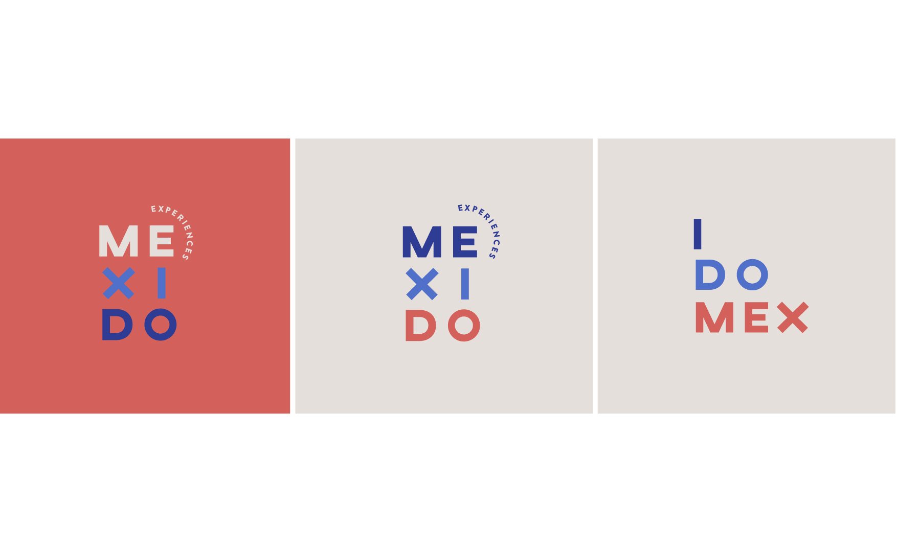
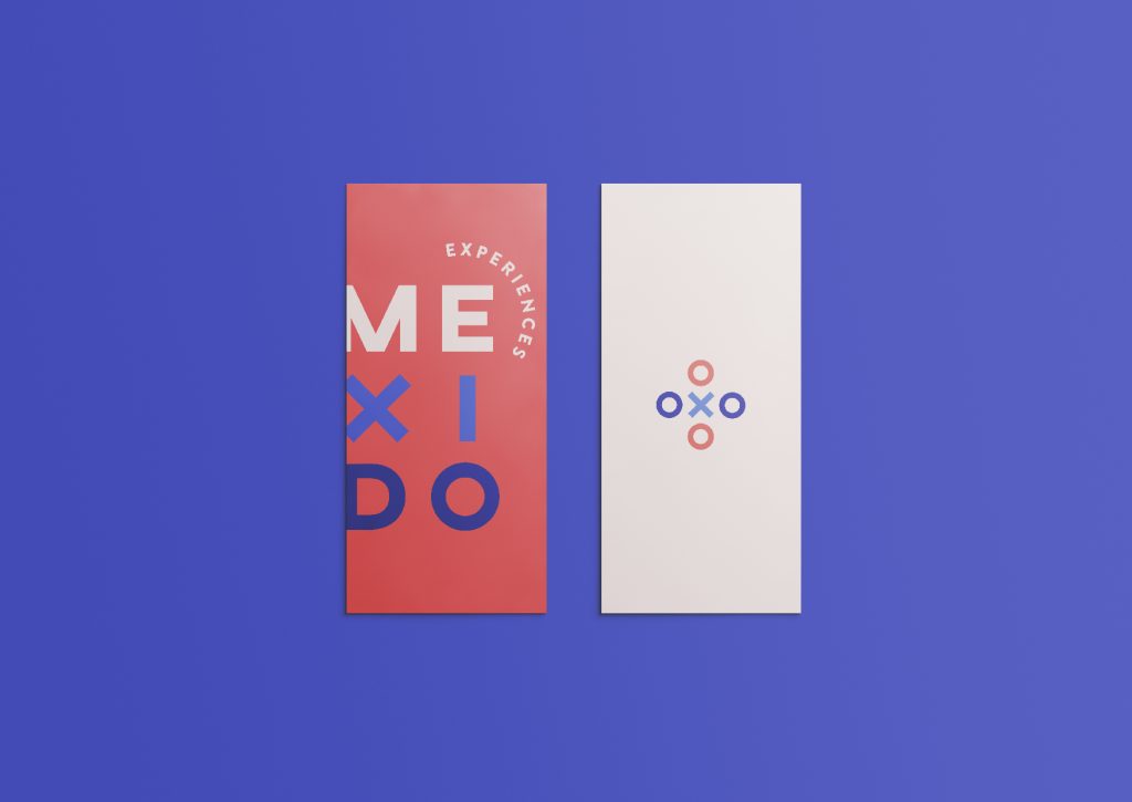
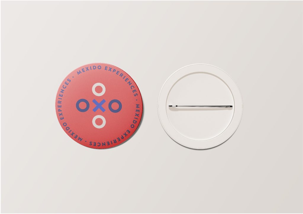
For the graphic part of the brand we looked for a strong typographic base that represented the essence of the brand and we had it very clear from the beginning, the ‘X’ should be the one from the axis typeface designed by Jean Wojciechowski. A straightforward sans-serif, clear and with enough character to convey the brand message. The ‘X’ itself allowed us to naturally develop a graphic element that accompanies the brand and offers a close and fun touch.