
Branding
The Andratx city council needed a restyling of its corporate image to adapt it to current communication needs with the aim of creating a very clean and linear logo that was clearly recognizable by citizens and offered a modern image. A city council that is modernizing its image and facing a digitization process needs to have a versatile visual identity.
Simplicity has been one of the fundamental premises to develop its visual identity. An organization like a city council needs to have a sober identity, which gives prominence to the content, but is identifiable at the same time.
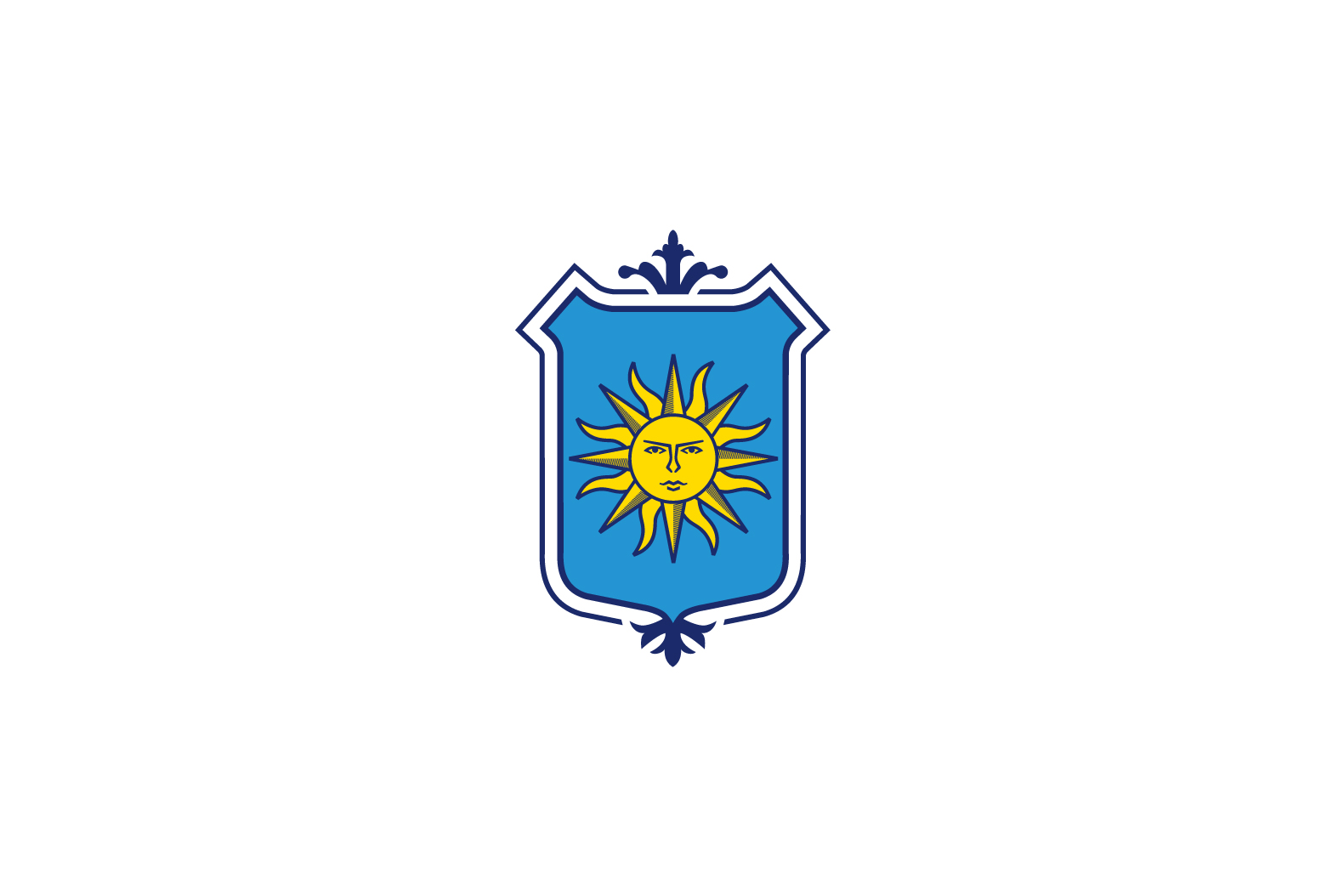
For the restyling of the shield we have based on its origin, whose first documents date from the year 1790, where we already find the sun in an engraving by Cardinal Antoni Des Puig.
The emblem of the Andratx shield is the heraldic sun, on an azure background, with eyes, mouth and nose, a serious face, and sixteen rays that surround it: eight straight and eight wavy. This evokes the geographical location of the former barony of the bishops of Barcelona in Mallorca, in the extreme southwest of the island, being the last town in Mallorca where the sun sets.
Legend has it that this sun is serious due to the discomfort it caused to the inhabitants of Andratx who ran into it face to face when they went down to work in Palma in the morning and found it face to face when they returned home in the afternoon.
For the new corporate image we have sought to give prominence to the heraldic sun and redefine its lines by looking for an image that represents this history. We have also redefined the colors to match their origin.

