Branding and Web Design
The ‘Colmados’ or ‘Ultramarinos’ were the grocery stores that supplied people after the war. These have been reinvented to adapt to modern times, bringing tapas and tinned food to the gourmet category, turning these ‘stores’ into tasting spaces.
Colmado Hispania is a tribute to tapas bars with waiters going from here to there and the shelves full of wines and tinned food. A meeting place for friends, for the afterwork on Friday… but above all, a space to taste and enjoy the good product seeking to pay homage to the rich culture of tapas so deeply rooted in our country.
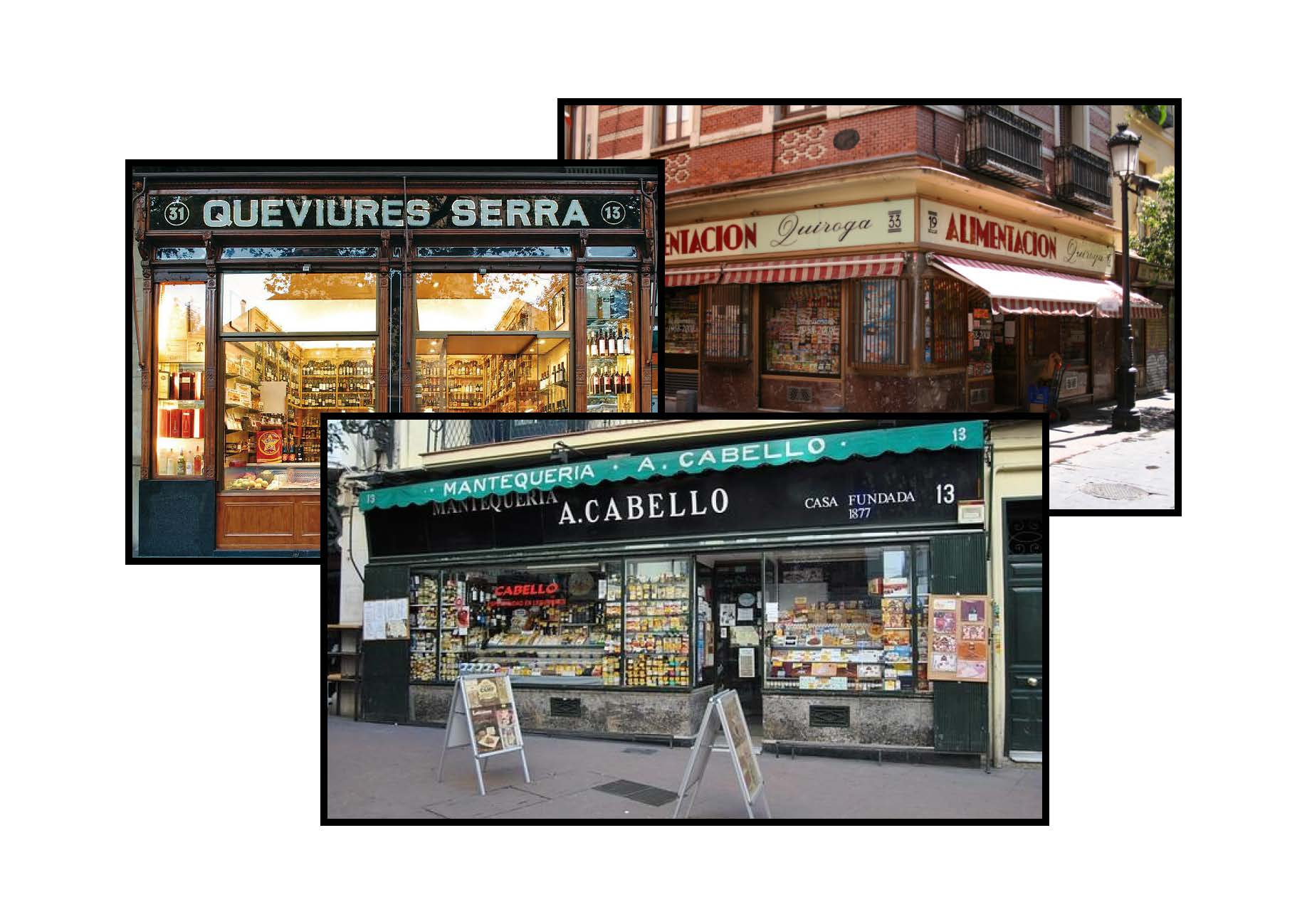
When it came to work on the branding we wanted to recover the essence and the aesthetic of those local stores with a modern touch that draws attention and creates its own style being a reference to the target clients, based on the classic signs of ‘colmados’ and ‘ultramarinos’ with thick sanserif typefaces with a lot of personality.
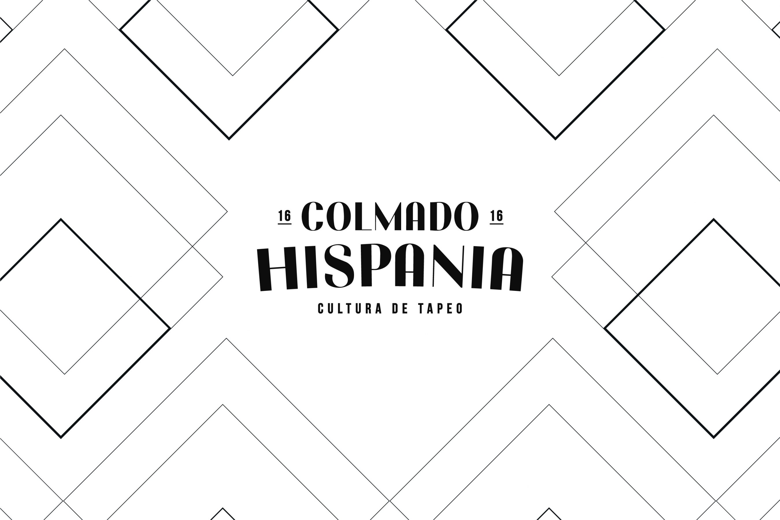
Inspired by the classic geometric patterns of the Roman Empire, who named Spain as Hispania, we have created a texture that is used as an auxiliary graphic that accompanies the brand in applications and helps in its communication.
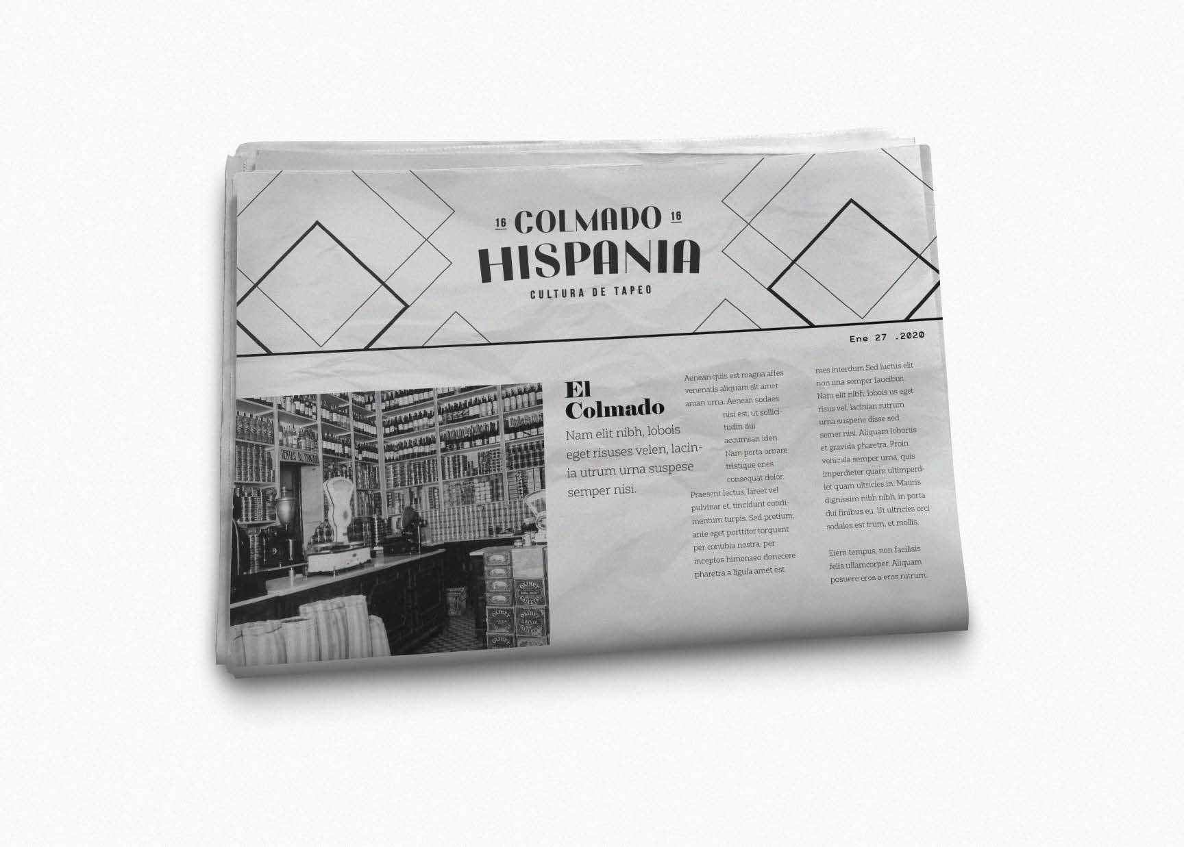
As part of the project we have been responsible for the design and development of a new website that would communicate the essence and personality of the restaurant and convert it into a conversion channel through which users will book a table directly.