Branding & Web design
De Juan & Moreno is a law and advisors firm with almost 30 years of experience in which has built an important reputation. In these 3 decades of professional career, no creative exercise had been carried out that translated into a graphic identity the values that characterize the team of De Juan & Moreno.
The objective of our proposal has been to create added value to their services through a new graphic and verbal identity adapted to the new times, distinguishable and easily recognizable.
In order to do this, we wanted to avoid shapes and colors that are frequently used in this type of firms and thus develop a series of graphic elements that visually impact the client and potential client.
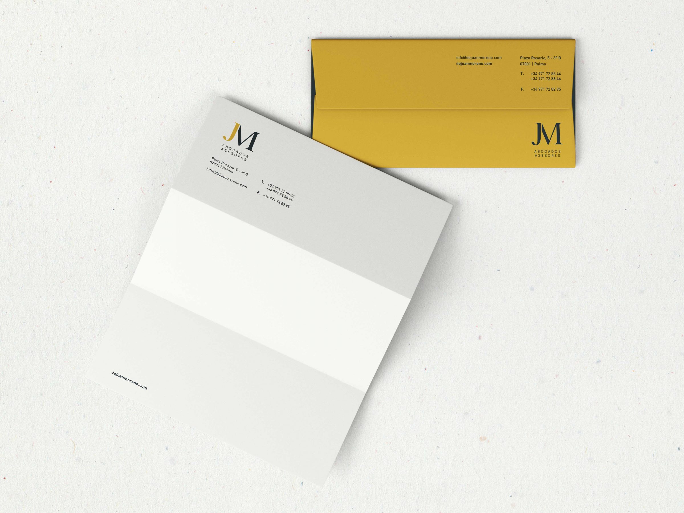
We have used a serif font that combines modern and elegant strokes giving the image we believe reflects the values of the firm. For the baseline we have used a simple, fine and clear font with the aim of granting uniformity to the whole.
At the same time, we have developed a reduced version of the brand for certain uses, creating a distinctive image with a touch of modernity with the aim of giving an innovative image.
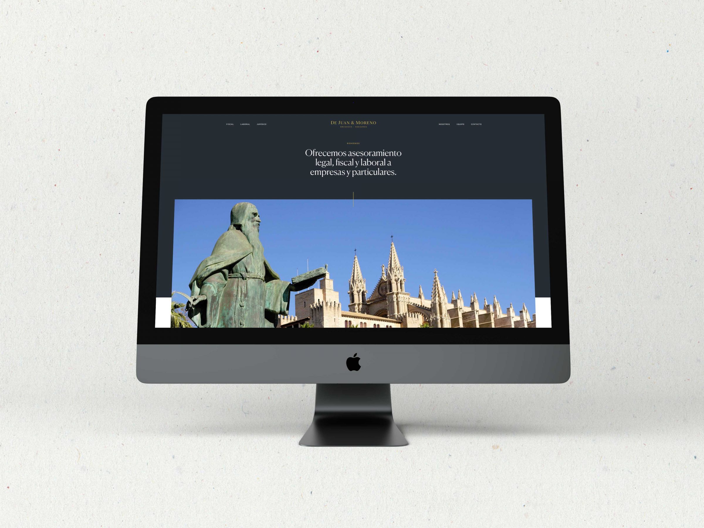
As part of the project we have transformed this visual identity to the online environment through the design and development of a new corporate website. Again, we wanted to escape from classism and go for a different website looking for that impact that we mentioned before. To do this, we proposed a design that would be natural, that did not present the contents and services as tight compartments, but instead would connect all the content in a simple and continuous way.
· Visit Website ·