Branding
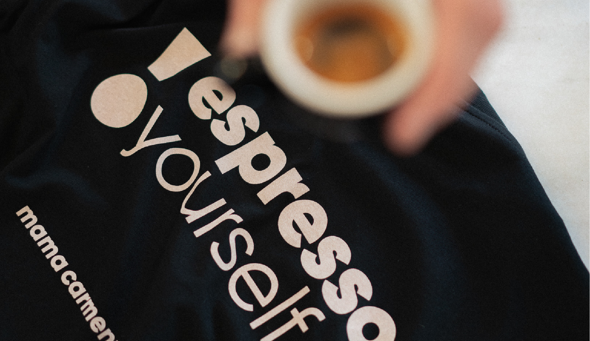
Rebranding project for Mama Carmen’s, one of the benchmarks in the world of speciality coffee in Mallorca, who are in full expansion with new venues and products. For the brand redesign we wanted to create a timeless image with a markedly urban feel, adding character and personality.
The concept of these coffee shops is inspired by the feeling you get when you go to your mother’s house, hence the idea of using the apostrophe and the dot to create the lock on the front door of your mama’s house, representing how you feel at Mama Carmen’s, like at home. From the apostrophe and the dot also comes the exclamation, which is what you think when you try their products, RIDICULOUSLY GOOD!
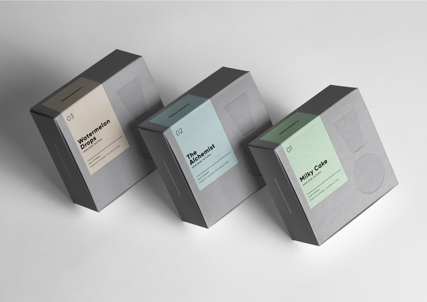
For the logo we used the Gilroy typeface, a sans serif with a lot of personality thanks to the geometric aspect it has and we created the baseline COFFE. BITES. SHOP. to represent the main products they offer directly.
As part of the rebranding project, we have developed a line of communication in social media through which we want to transmit the essence of its premises and products.