Rebranding
Miró Packaging is a reference company in the packaging industry with more than 60 years of experience. It is a family business that has evolved and has adapted to new times and trends offering specific and unique solutions to its customers. A type of customer with a lot of criteria that seeks the best solutions to present their products.
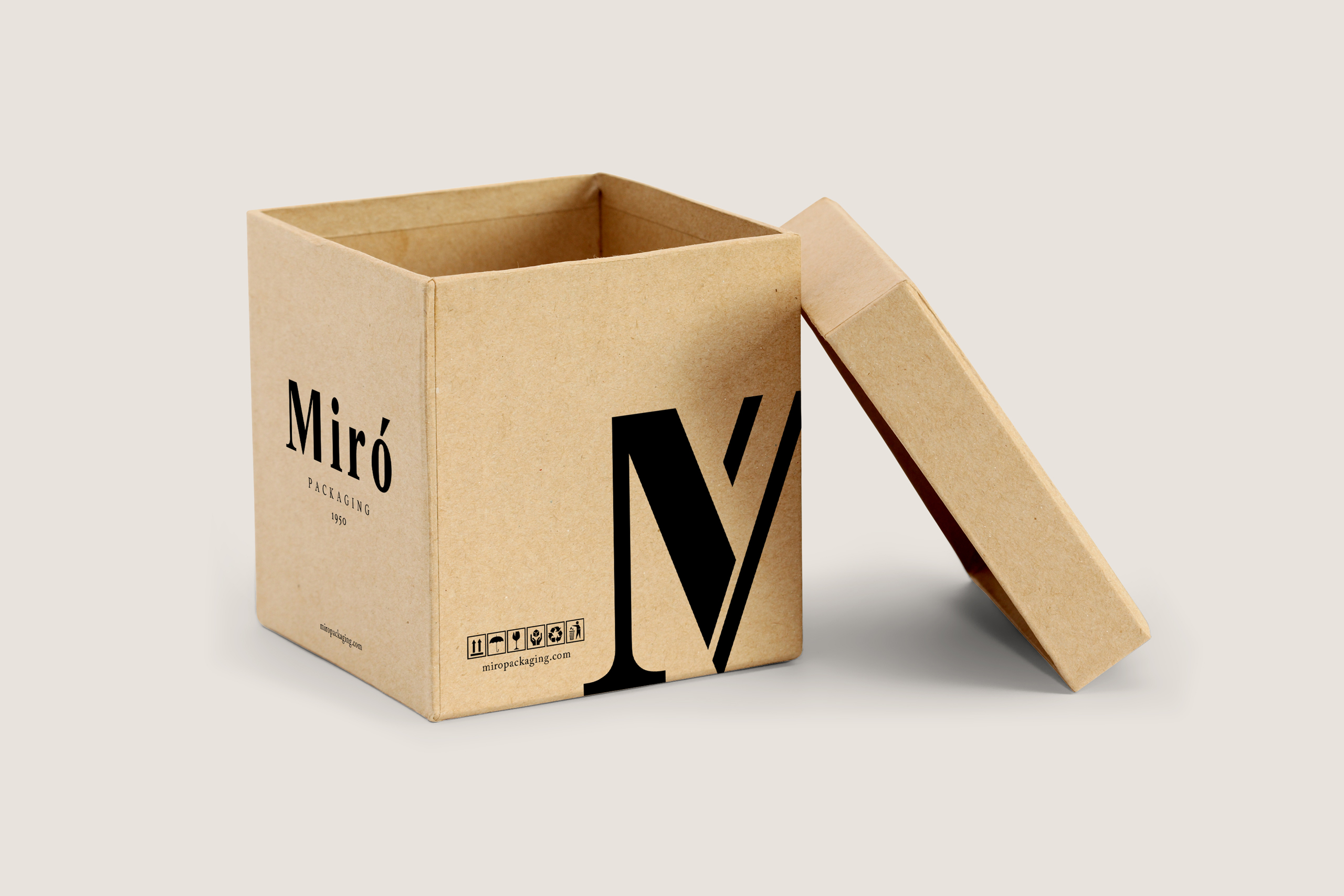
Based on these characteristic values we can say that Miró is a modern and elegant company but with a very strong tradition. That is the reason why for the restyling of the brand we were clear that we should look for a series of graphic elements that offered a balance between modern and traditional.
To achieve this, we developed an elegant typography, which follows a classic line but that maintains modern elements to offer this balance that we’ve mentioned. Finally we have reinforced the accent mark line with the aim of giving more strength to Miró’s name.
With the aim of emphasizing the experience acquired during these more than 60 years we have included the year the company was founded.
For the reduced version of the logo we have chosen to combine the ‘M’ and the accent mark as more characteristic elements of the brand in order to create an element easy to recognize and associate to the brand.
The blue transmits calm and inspires confidence and security, key ingredients in the management of all Miró customers, which we have combined with a warm gray to obtain a harmonious and current set.