Rebranding
When Joan and Mara from Dolça Pastisseria explained their project to us, we just knew that their brand had to represent their passion for pastry and chocolate making. Narez & Cuart was born to create an identity and to reinforce their personality; it is a brand that reflects the elegance of their work while showcasing the freshness and modernity that characterises them.
The creation of a totally artisan fine quality product enables to create unique experiences and offers the possibility of narrating a story focusing on their personality and their product.
The conceptualisation emerges from Mara and Joan’s passion for pastry and chocolate making, two really attractive, visually powerful means. Two people that are like two fundamental opposed forces yet complementary that can be found in all things, just like Ying and Yang, a balance and dynamism that can be observed in all their products.
We believe that behind the technique required for a trade like this, totally artisan, there clearly is an artistic freedom, which must be encouraged and made the most of. We envision the brand concept as the representation and creation of sweet artworks, with a conceptual base similar to art galleries or fine jewellery brands.
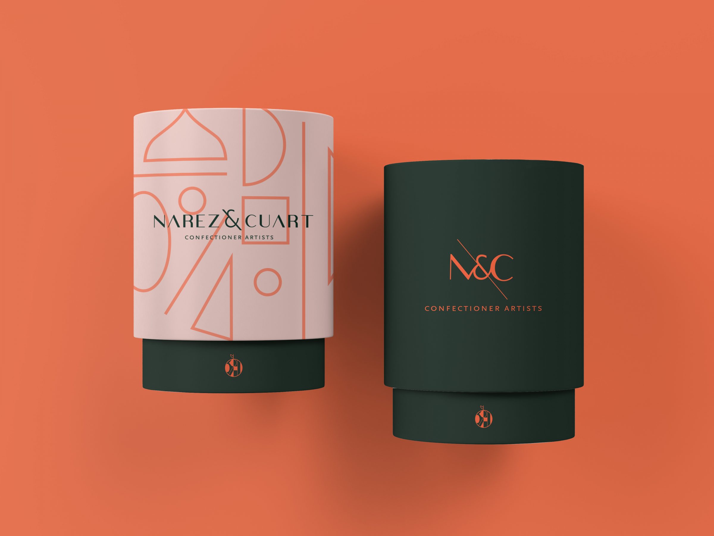
When working on the font, it was fundamental to define a body with elegant lines, yet modern and fresh. We seek a balance among lines but a contrast at the same time, hence we combined thicker with thinner ones. We used ampersand to represent the Ying and Yang, that dualism that coexists in the work of Narez and Cuart. For the baseline, we used a second font that was clear and readable whilst being convincing.
We thought that it was necessary to develop an element that represented the brand’s essence and that was easy to acknowledge beyond the brand’s reduced use. After analysing their work, we found many references of shape superposition, artistic lines and carefully selected colours. What we did was put them in order and shape them to combine their whole essence in a symbol.
For this project, we were very clear about the packaging’s conceptualisation goal. A temptation to the palate, a box to keep. We had to treat each product as unique and exclusive pieces that work and manage to connect to form a whole. In turn, the fact that they are very active from a creative point of view and that they identify themselves with a freestyle philosophy meant that we were dealing with a project with countless creative possibilities.
As part of the project we have transformed this visual identity to the online environment through the design and development of a new corporate website. We wanted to keep the essence of the Mara & Joan combined with an eCommerce platform in order to sale their products online by displaying their creations in an attractive way and facilitating the purchase to the users.